The Components That Make Up An Entando Application - Page, User Management and Localization Components
This blog post is the last of a series that dives into details about Entando components, how they can be defined in a bundle and deployed to an Entando Application, how they are configured via Entando App Builder, and how they are rendered in your application.
Hey my fellow developers,
Here we are for the third episode of the Entando component sub-series. After having discovered CMS content, we will learn more about how to manage pages, user groups and i18n components.
This blog post is the last of a series that dives into details about components including how they can be defined in a bundle, how they can be deployed to an Entando Application, how they are configured via Entando App Builder, and how they are rendered in your application.
This blog post is part of the Entando bundle series:
- Sharing Components in a Marketplace for Developers with Entando Bundles
- The Components That Make Up An Entando Application
- Frontend and Backend Components
- CMS Components
- Page, User Management and Localization Components
- Generating and Deploying Micro Frontends and Microservices With Entando Blueprint
Table of Contents
- Page management
- Page template
- Page
- User management
- Groups
- I18n
- Languages
- Labels
- Compose a main descriptor file
- Conclusion
Page management
Page Template
A page template defines a default page configuration that is assigned to an instance of a page. Page templates can be a standard 2 column layout or can be customized to meet any design. The template combines frame configuration and HTML template rendering with Freemarker.
code: seed_home description: Seed homepage configuration: frames: - pos: 0 description: brand mainFrame: false sketch: x1: 0 y1: 0 x2: 1 y2: 0 - pos: 1 description: navbar mainFrame: false sketch: x1: 2 y1: 0 x2: 7 y2: 0 - pos: 2 description: login widget mainFrame: false sketch: x1: 8 y1: 0 x2: 9 y2: 0 - pos: 3 description: empty space mainFrame: false sketch: x1: 10 y1: 0 x2: 11 y2: 0 [...] templatePath: seed_home.ftl
- configuration.frames contains each frame the template has, its position and the description.
- pos the position in the page, from 0 to the max number of frames you want. The position is used in the freemarker template to place it: <@wp.show frame=2 />
- description is a short description that appears on the app builder design page to let you know what is the frame is made for
- mainFrame true if it’s the main page frame
- sketch
- templatePath defines the path to the freemarker template. Alternatively, you can use the template property to put the raw template directly into the descriptor.
<#assign wp=JspTaglibs["/aps-core"]><#assign c=JspTaglibs["http://java.sun.com/jsp/jstl/core"]> <html lang="en"> <head> <meta charset="utf-8" /> <title><@wp.currentPage param="title" /> - <@wp.i18n key="STANDARD_DEMO" /></title> <meta name="viewport" content="width=device-width, user-scalable=no" /> <meta name="description" content="" /> <meta name="author" content="" /> <link rel="icon" href="<@wp.info key="systemParam" paramName="applicationBaseURL" />favicon.png" type="image/png" /> <@wp.fragment code="insurance_inclusions" escapeXml=false /> </head> <body> <@wp.fragment code="keycloak_auth" escapeXml=false/> <div class="custom-navbar "> [...] <@wp.show frame=4 /> <@wp.show frame=5 /> <@wp.show frame=6 /> <@wp.show frame=7 /> <@wp.show frame=8 /> <@wp.show frame=9 /> <@wp.show frame=10 /> <@wp.show frame=11 /> <@wp.show frame=12 /> <@wp.show frame=13 /> </div> <@wp.fragment code="insurance_inclusions_footer" escapeXml=false /> </body> </html>
The seedHome freemarker template. The navBar has been removed to make it easier to read
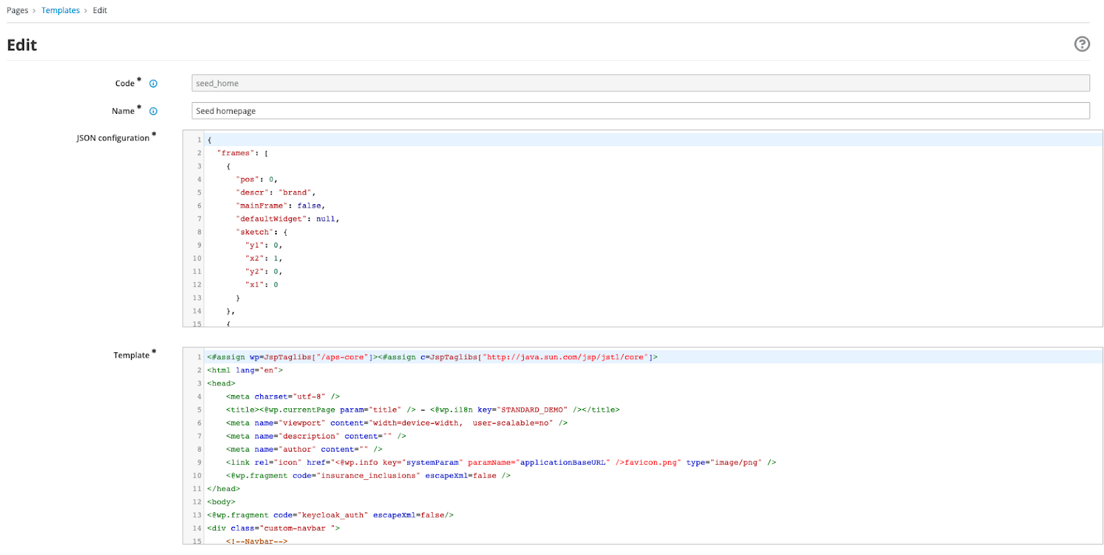
The template can be edited in the app-builder under the menu Pages > Templates > Edit
Page
A page is composed of multiple widgets or UX fragments and defines a position for each of them. A page includes a reference to a page template (“pageModel”) and will inherit everything included in the page template.
code: homepages parentCode: homepage titles: en: Home SD it: Home SD pageModel: seed_home ownerGroup: free joinGroups: [] displayedInMenu: true seo: false charset: utf8 status: published widgets: - code: Brand-Logo config: null pos: 0 - code: Login_buttons config: null pos: 2 - code: content_viewer config: contentDescription: main-banner modelId: '1' ownerGroup: free contentId: SDB37 joinGroups: '[]' pos: 4 - code: content_viewer config: contentDescription: banner light green modelId: '2' contentId: SDB34 pos: 5 - code: content_viewer config: contentDescription: Banner with inner card modelId: '3' contentId: SDB31 pos: 6 - code: content_viewer config: contentDescription: Banner with accordion modelId: '4' contentId: SDB16 pos: 7 - code: content_viewer config: contentDescription: Banner with dark green background modelId: '5' contentId: SDB28 pos: 8 - code: content_viewer config: contentDescription: Banner with white background modelId: '6' contentId: SDB19 pos: 9 - code: footer config: null pos: 13
- code is the unique page identifier.
- parentCode is the code of the page parent, a page can be either a parent or a sub page.
- pageModel is the page template used to render the page.
- ownerGroup is the owner of the page. “free” if the page can be used without restrictions
- joinGroups list of groups the page is shared with. These groups can edit and use the page.
- displayedInMenu true to display this page in the default widget menu.
- seo
- charset the charset used to render the page according to the encoding used.
- status is published if the page is available in your application.
- widgets is an array of objects to define which widgets will be included in the page, it’s position and the configuration if needed.
- code the widget code you want to include. It has to be the same value as the “code“ in the widget descriptor.
- config the configuration for this widget instance, can be null if no configuration. The configuration object is related to the widget itself.
- pos the position in the page. It should match a frame pos value in the pageTemplate.
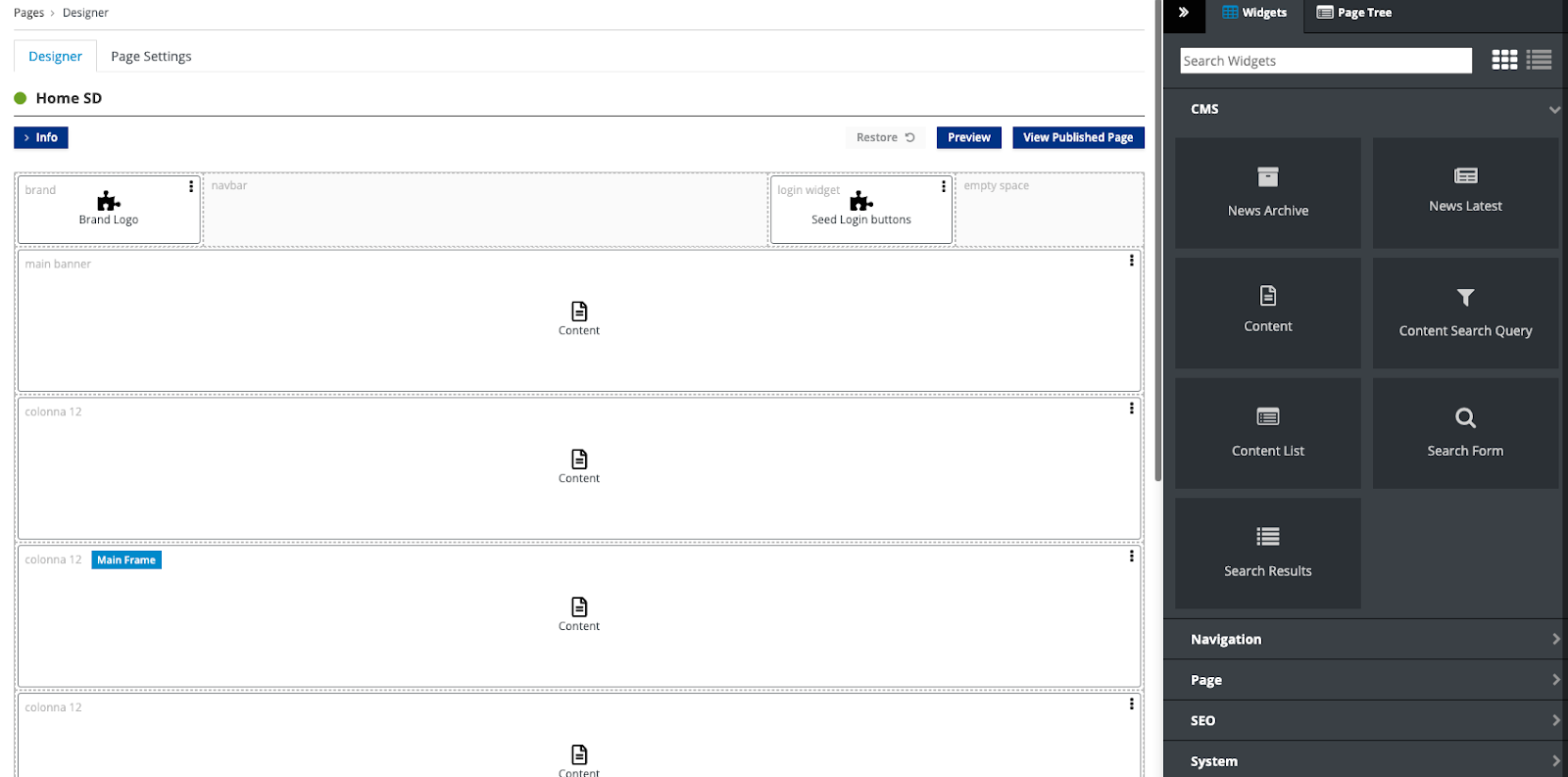
You can design and check the page configuration in the app-builder
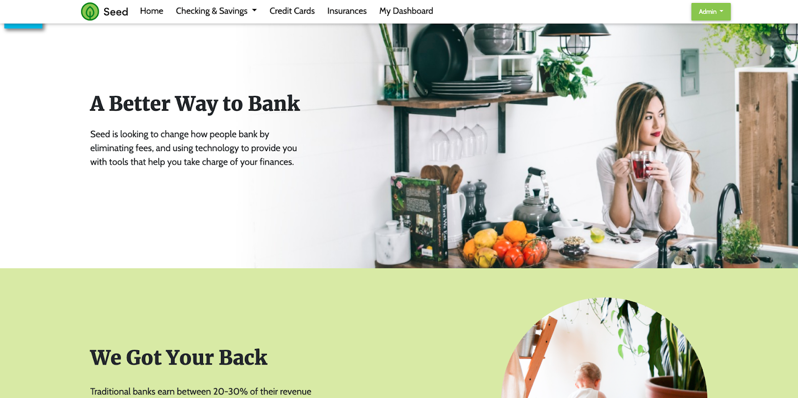
The SD homepage is rendered through the bundle configuration we defined
User Management
Groups
A group gathers users under a sub-organization and can be used to define the ownership of some components.
- code: bpm_admin name: Bpm Admin - code: bpm_appraiser name: Bpm Appraiser - code: bpm_broker name: Bpm Broker - code: bpm_manager name: Bpm Manager
- code the unique group code.
- name the group name.
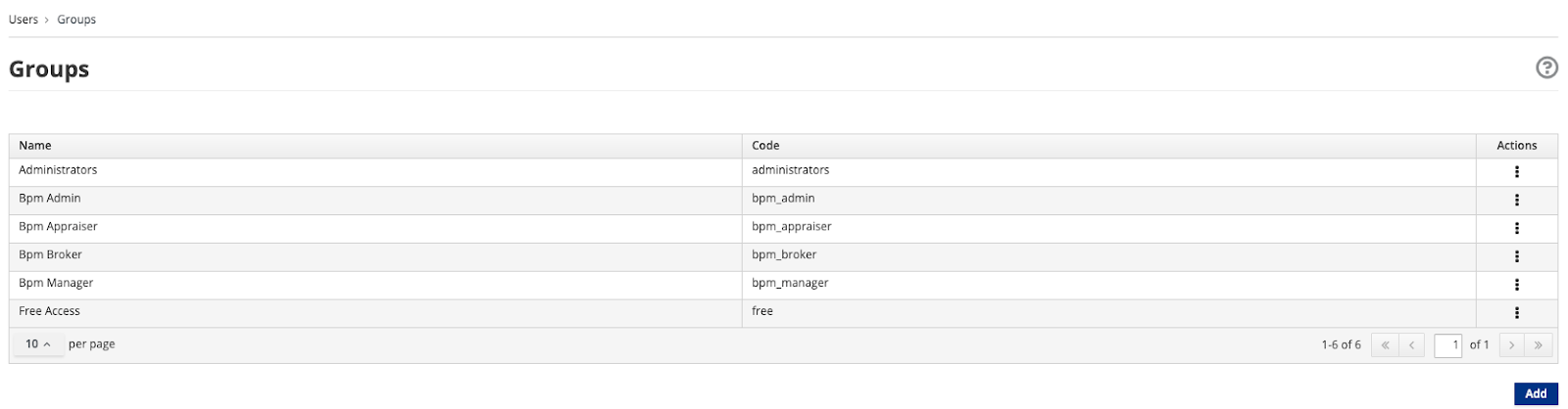
Groups can be displayed through the Users > Groups menu in the app builder
I18n
Languages
The languages component allows you to enable several languages in your application and to unlock labels for them.
- code: en description: English - code: it description: Italian
- code the language code, basically the ISO 639-1 code (alpha-2 code).
- description a quick description of the language, most of the time the language name.
Labels
Labels are a key/value system to populate the languages you have enabled in your application.
- key: ADMINISTRATION_BASIC titles: en: Normal it: Normale - key: ADMINISTRATION_BASIC_GOTO titles: en: Go to the administration with normal client it: Accedi con client normale - key: ADMINISTRATION_MINT titles: en: Advanced it: Avanzata - key: ADMINISTRATION_MINT_GOTO titles: en: Go to the administration with advanced client it: Accedi con client avanzato
- key is the unique key for the label
- titles contain a value for each enabled language (by code).
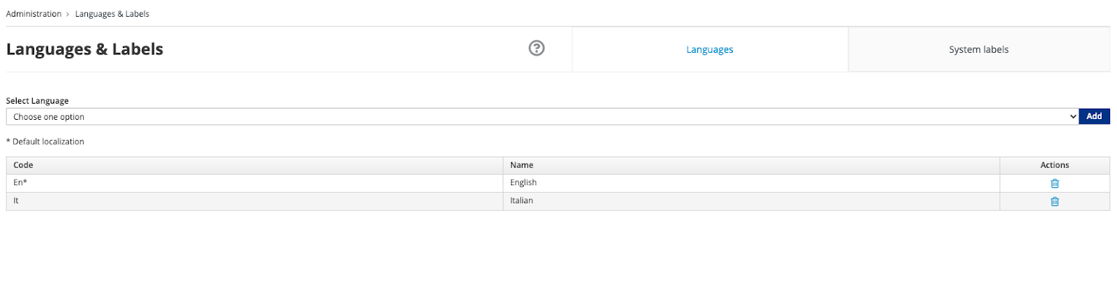
Languages and labels are available in the Administration > Languages & Labels menu
Compose a main descriptor file
Now that you know each component you can define a descriptor per component and group them, by convention, under a folder per component type.
For example, the Standard Demo Bundle repository has a large bundle with examples of each of the component types we reviewed in this blog post.
Once you’ve created a descriptor for each of the components they can be referenced by path from the top level descriptor.yaml file (except for static resources).
code: standard-demo description: Standard Demo bundle components: widgets: - widgets/brand-logo-descriptor.yaml pageModels: - pageModels/dashboard-descriptor.yaml fragments: - fragments/angular-descriptor.yaml pages: - pages/homepagesd-descriptor.yaml groups: - groups/groups-descriptor.yaml contentTypes: - contentTypes/mpc-descriptor.yaml contentModels: - contentModels/main-banner-descriptor.yaml assets: - assets/35/35-descriptor.yaml contents: - contents/mpc584-descriptor.yaml plugins: - plugins/standard-demo-banking-descriptor.yaml categories: - categories/categories-descriptor.yaml labels: - labels/labels-descriptor.yaml languages: - languages/languages-descriptor.yaml
Note the bundle uses technical names instead of official names for some components (e.g. contentModels for Content Type, pageModels for Page Template, assets for CMS Assets…). Please, refer to the documentation or the demo bundle to view the correct labels in the yaml.
Conclusion
In this blog post series we learned about all of the components we can use in our bundles and in our Entando applications. Each component has attributes that allow you to define their behavior and structure. Once you’ve built your components all you have to do is declare them in the main bundle descriptor, that's all! Easy, isn’t it?
See you soon for the next adventures with bundles and components.